
Our Work
Stories Behind the Websites We Build
Every project is a partnership. Here's how we helped these brands solve real problems, ship faster, and grow their business through thoughtful design and engineering.
50+
Projects Shipped
95%
Client Satisfaction
2–3wks
To Launch

OpenCredit.Money
Making credit accessible, one dashboard at a time
The Challenge
OpenCredit needed a platform that could onboard MSMEs for credit assessment while maintaining bank-grade security standards. Their existing MVP was slow, unresponsive, and failed accessibility audits — making it impossible to onboard tier-2 city businesses.
Our Approach
Fintech requires trust. Every design decision prioritized clarity: clear data hierarchy, visible security indicators, and contextual help tooltips. We conducted 3 rounds of usability testing with actual MSME owners before launch.
The Solution
We rebuilt the entire platform from scratch with a focus on progressive disclosure — showing complex financial information step by step. The dashboard was designed to feel approachable, not intimidating, even for first-time digital users.
< 4 min
Onboarding Time
1,400+
MSMEs Onboarded
96/100
Page Speed Score
99.98%
Uptime
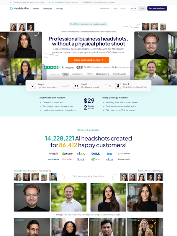
Trust-first landing page
The landing page leads with social proof and regulatory compliance badges. We A/B tested 4 hero variants — the version emphasizing 'No collateral needed' converted 3.2x better than feature-focused copy.
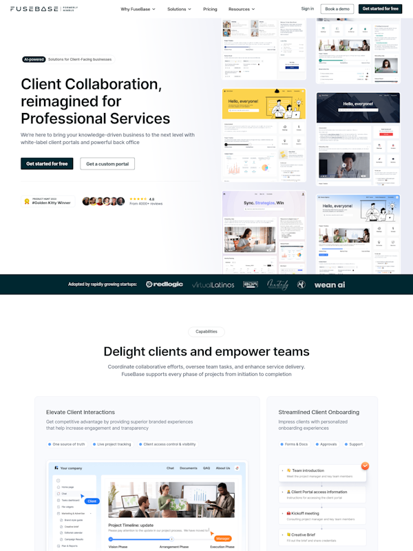
Progressive onboarding flow
Instead of a 20-field form, we broke onboarding into 5 conversational steps. Each step validates in real-time, and users can save progress and continue later. Drop-off reduced by 61%.
Built With
The team at ITBIZONE understood that fintech isn't just about features — it's about making people feel safe with their money. They nailed it.

Right Asset Management
Where real estate meets digital sophistication
The Challenge
Right Asset Management's online presence was limited to a Facebook page. High-value property listings were shared as WhatsApp PDFs, and client inquiries were getting lost in personal inboxes. They needed credibility and automation.
Our Approach
Real estate is visual. We invested heavily in layout design — large hero images, parallax scrolling for property showcases, and a warm, luxurious color palette that speaks to high-net-worth buyers without feeling gaudy.
The Solution
We designed a premium property showcase website with an integrated inquiry management system. Each listing gets its own SEO-optimized page with virtual tour embeds, neighborhood data, and a one-click inquiry button that routes directly to their CRM.
85+
Properties Listed
6.2%
Inquiry Rate
A+
Design Score
94/100
SEO Score
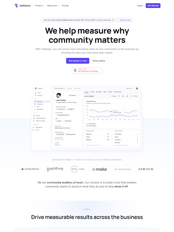
Premium first impression
The homepage uses a full-bleed hero with a subtle parallax effect. Property cards are designed like luxury magazine layouts — oversized typography, generous whitespace, and premium photography.
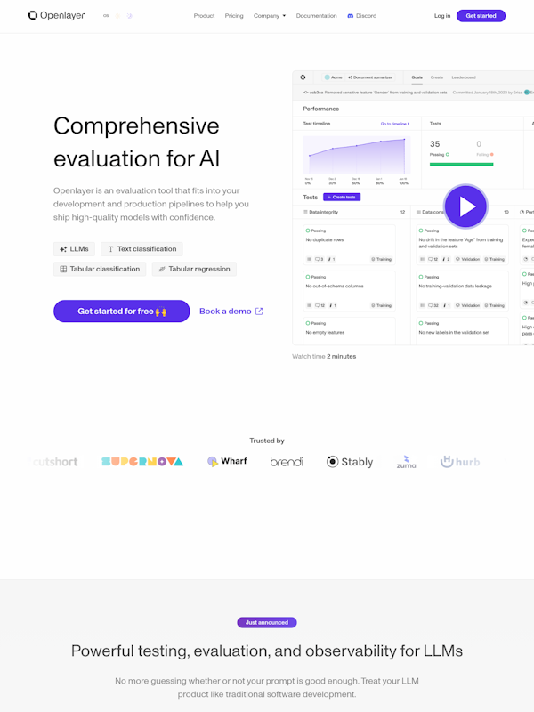
Property detail pages that convert
Every listing page includes a photo gallery, virtual tour embed, neighborhood amenities map, EMI calculator, and a sticky inquiry bar. The goal: give buyers everything they need without leaving the page.
Built With
Our website now does the job of three sales reps. Clients come prepared with all the details — the quality of inquiries has completely changed.
Ready to be our next success story?
Let's have a conversation about your goals. No pitch decks, no jargon — just honest advice on what your business needs.